Here lies the Sliding Pane Layout. RIP
A justification for some of the design choices I made; The second part in a series of essays leading up the release of Conversations 2.0
I had been a Jabber user for many, many years when I got my first Android device in 2012. It was around that time when Android received its first major UI overhaul called Holo. As a result the available Jabber clients all looked very dated to someone like me, who had never experienced the pre Holo UI first hand. The situation didn’t improve much over the next two years. Functionality aside, the pure aesthetics of Xabber and ChatSecure were enough to stop me from using Jabber on my new mobile phone and instead drove me towards using Hangouts. (For those who are not old enough to remember; Hangouts was one of many failed attempts from Google to step into the instant messaging market.) Despite all that I kept using Jabber on my desktop and kept wanting to use it on my phone as well. This ultimately lead me to the question on why those apps seemed to struggle with modern UI design. Finally in early 2014 I set out to answer that question and started to experiment and taught myself how to develop Android apps. My first task: A pixel perfect UI mockup clone of Hangouts with the working title »Secure Conversations« - A rather uninspired rip-off from »Chat Secure«, the name of one of the existing Jabber clients. Some weeks later, in my very own Facebook moment, a friend of mine, taking over the role of Justin Timberlake, would tell me to drop the »Secure«. But I’m getting ahead of myself.
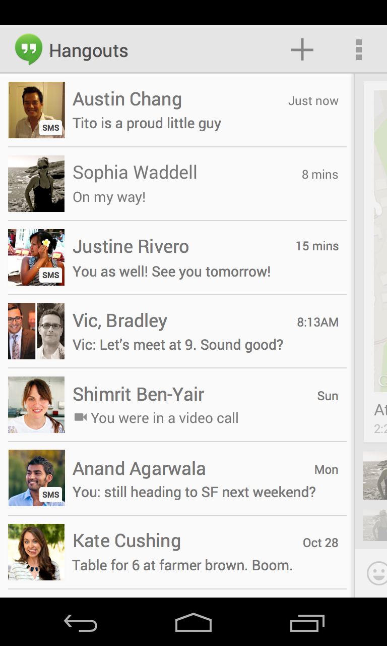
A screenshot of Google Hangouts
A few days and a lot of taking screenshots, color picking and measuring pixel distances, later I had a nonfunctional Hangouts clone only to ask myself; How hard would it be to teach that thing to send and receive XMPP messages? Fast forward three month and sparing you the details of me reading RFCs, staring at Gajim’s XML console and trying to figure out what on earth that session thing was that wasn’t mentioned in the RFC but appeared to be required by some servers, (If you couldn’t tell that was a very funny inside joke for approximately 3 or 4 people in the world.) I had my answer. All things considered: Not very hard. I released version 0.1 of Conversations on March 24th 2014.
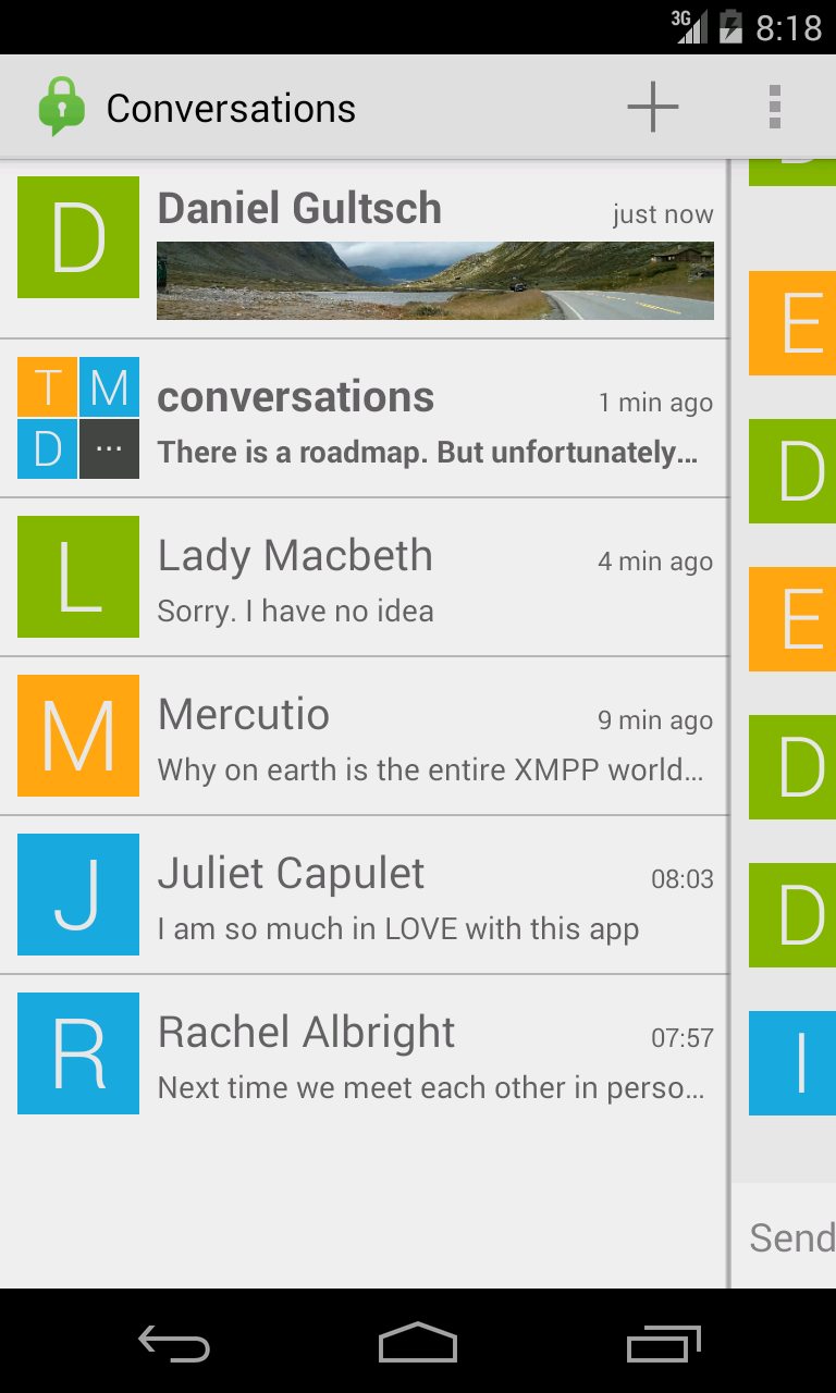
A screenshot of Conversations in early 2014
So why am I boring you with my walk down memory lane? The important thing to take away here is that Conversations originally was a UI mockup turned let’s see how hard that XMPP thing is-experiment, developed by someone who, at the time, had very little experience with large scale software projects and no experience whatsoever developing for the Android platform. While the backend code - the one that handles the XMPP processing - has been refactored at least once or twice, the UI code was never touched again aside from a few superficial changes when Google, again, overhauled the UI of Android. (At least Android UIs have a longer life expectancy than Google’s instant messaging products.)
Needless to say that some of the design choices, like the sliding conversation overview, came out of fashion when Hangouts first dropped that design pattern and then went to the museum of failed Google products where it now resides next to Google Wave and Google Reader.
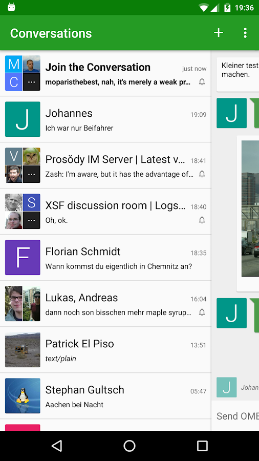
A screenshot of Conversations adopted to use Material Design colors
The sliding panel could not easily be removed as that would have required a substantial amount of refactoring. And people who got used to the sliding feature loved it. Including myself. Unfortunately, given the fact that Hangouts was never really popular in the first place, people quickly forgot that the sliding panel once was a thing and newcomers to Conversations were regularly quite confused by it. So confused that a lot of people even reported it as a bug. Confused people alone are famously not a reason for me to change something on Conversations. However for the upcoming Conversations 2.0 I wanted to make QR code scanning a more prominent feature. Both for adding and verifying users as well as opening up the possibility to later use it for onboarding and account creation purposes. Unfortunately the toolbar in the main Conversations view was already quite full and I didn’t want to have two actions (start new conversation and scan) in that toolbar. Therefore the thought came up to put the main action of starting a new conversation into one of those infamous and overused FABs (Floating Action Button, the colorful button thing in the bottom right corner) and using the newly gained space in the toolbar for the secondary scan action. At the same time introducing the FAB would hopefully solve the issue that apparently some people weren’t able to figure out how to start a new conversation.
The FAB, while being dramatically overused, is a very common design pattern on Android these days. And even though »WhatsApp does it« in itself is not a good enough reason to do things a certain way it certainly doesn’t hurt if starting a new conversation is done with a similar looking button in both Conversations and WhatsApp.
However I can’t put a button in the bottom right corner when that space is occupied by the half open conversation. And I also can’t move the Floating Action Button more to the left because that would look pretty weird. That meant finally having to get rid of the sliding panel. And by that extend - you’ve guessed it - refactoring a lot of the UI code. Six ten-hour days later the task had finally been completed. After the new bugs, that I almost certainly introduced, will be eliminated, the new code will provide a solid base for future UI endeavors.
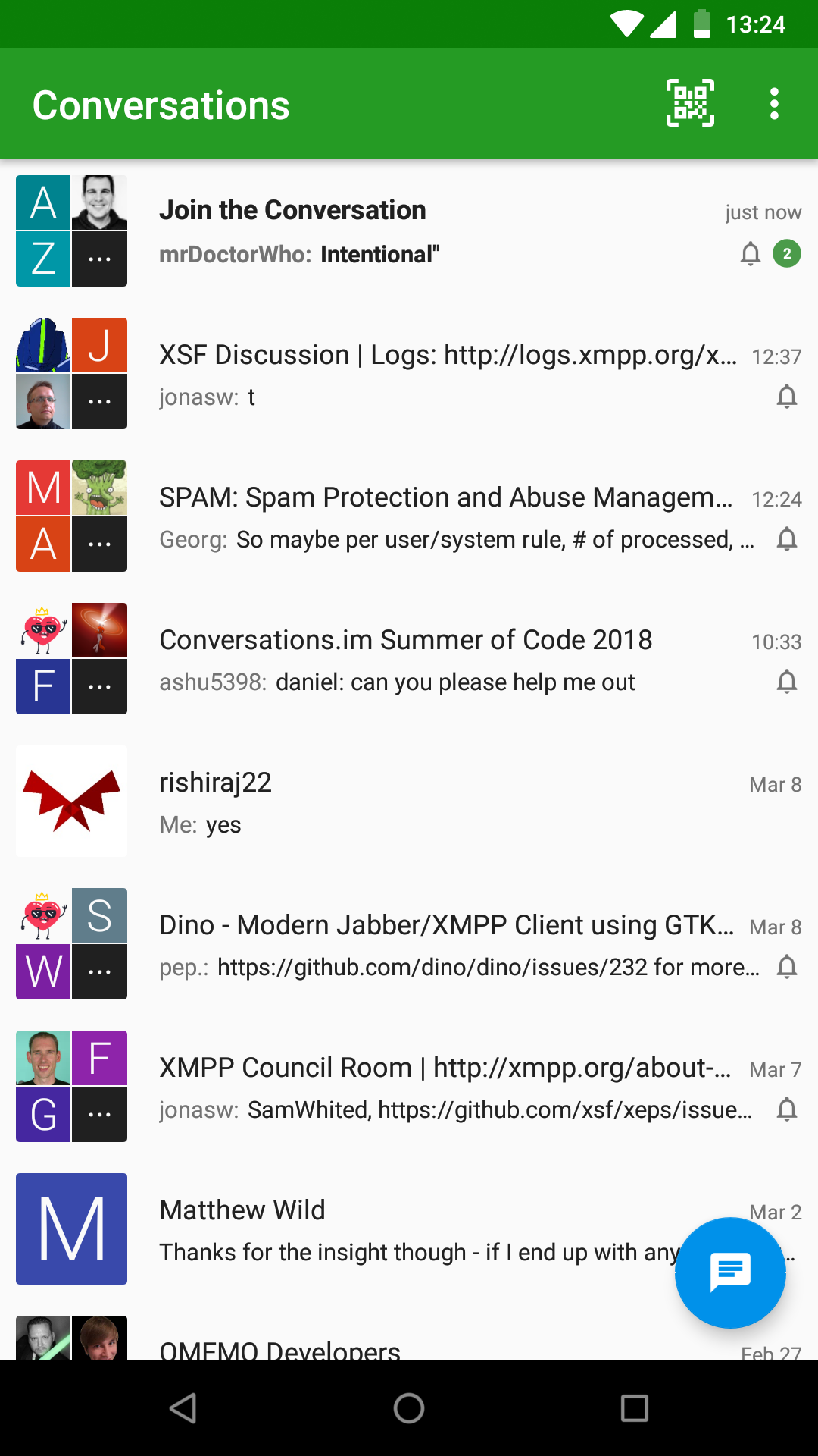
A screenshot of Conversations 2.0
I loved the Sliding Pane Layout very dearly to a point where I missed having it in WhatsApp. Nonetheless going back now to an older version of Conversations and seeing it feels kinda weird. I suppose that’s the sixth stage of grief after acceptance. It took me about two weeks to get to that point.
Sliding Pane Layout. You served us well over the last four years. Rest in peace.